Fixing the Convective Outlook: A Research-Based Solution
Want to start an argument among a group of meteorologists? Ask them what they think about the Convective Outlook issued by the Storm Prediction Center (SPC). No other product produced by the different weather agencies under NOAA generates more discussion, feedback, and pushback than that.
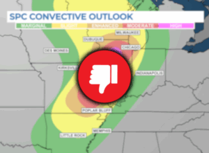
The disagreement on the best way to display the Outlook is apparent whenever there’s a risk of severe weather. Flip among different television stations or scan social media, and you’ll likely see many different versions of the Convective Outlook. There are even inconsistencies within the National Weather Service. The scales are different. The colors are different. Some meteorologists use numbers to rank the risk level. Some use words. Some use both.
A communication problem and solution
Members of the public who compare different sources of weather information are likely to find various forms of the Outlook on-air and online. As meteorologist Castle Williamsberg points out in his dissertation, these inconsistencies can create confusion and uncertainty.
Over the years, researchers have conducted many studies on the inconsistency of messaging within the weather enterprise. Much of the research focuses on the Convective Outlook. Some studies have looked at the accuracy of the forecast. Others have considered the effectiveness of the different words and colors used to convey the risks of severe weather.
At the risk of adding more discussion and potential disagreement regarding the Outlook, I offer a solution based entirely on the science of communication:
1. Refrain from using the SPC’s risk descriptions and instead refer to storm coverage.
2. Add numbers to the map, ranking the risk levels from 1 to 5.
3. Switch from the standard rainbow colors to simpler color shades.
Here is what the updated Outlook would look like based on these recommendations and the research that supports these changes.
The genesis of this storm
Meteorologists at the Storm Prediction Center created the Convective Outlook in 1973 to identify the locations across the United States with a moderate to high risk of severe thunderstorms. Over the years, as forecaster skill levels improved, SPC added new risk levels. The most recent change occurred in 2014 when “marginal” and “enhanced” risks were added to the Outlook. That seems to be when the trouble started.

The change happened suddenly for meteorologists, who were now tasked with explaining these new categories to the general public. Unlike the National Hurricane Center, which spends years studying potential changes to its forecast products and seeks public input multiple times throughout a study period, the new scale implemented by the Storm Prediction Center seemed to have been developed very quickly with minimal input from the end users, including the general public.
Much of the confusion stems from the two new risk levels added to the scale. Is “marginal” worse or better than “slight?” Is “enhanced” worse or better than “moderate?”
SPC knew this would be confusing. According to meteorologist Sean Earnst, “In anticipation of concerns over the wording, the SPC worked to wed colors and numbers to each of the categorical levels and developed a graphic describing the expected outcomes that each category forecast.” In other words, everything will be fine as long as everyone carries around this handy chart.
Reducing the risk of confusing communication
Ernst and his colleagues wanted to see if “nonexpert users like the general public” understood the new Convective Outlook categories. Not surprisingly, they found that the words assigned by SPC to describe the different risk levels are not intuitive to most people. Only 7% of people surveyed listed the category words in the correct order. “The largest group of participants in this survey ordered the SPC category words as ‘Slight, Marginal, Moderate, Enhanced, High,’ in contrast to the order used in the official product.”
The official order, of course, is Marginal, Slight, Moderate, Enhanced, High. Nope. That’s wrong, too. See the problem?
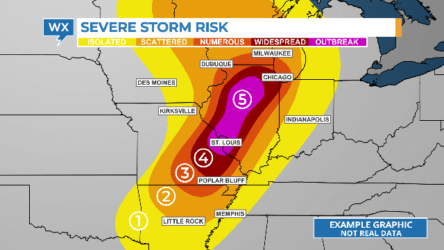
When SPC launched the updated scale, I was the chief meteorologist at KTRK, the ABC-owned station in Houston. After much discussion among the weather team, we decided to forgo the confusing risk levels and focus instead on the number of storms that might develop in each color-coded highlighted area: isolated, scattered, numerous, and widespread, similar to the map below. A fifth level designates a high risk of widespread severe storms.
The storm coverage is mentioned in the reference chart created by the SPC and communicates the risk of severe weather more effectively. It makes sense. The more storms that develop in an area, the greater the risk that one of them will impact you.
Adding numbers equals a better understanding
Research compiled by Makensize Krocak and others suggests another option. “The current categorical labels are often misinterpreted and misordered,” they wrote in their published paper. “We find unlike the current system, numeric information is much less likely to be misordered.”
Telling viewers that the risk of severe storms developing is a “level 3 out of 5” is easier for the public to understand than saying there’s an “enhanced risk.”

While Krocak’s team does not recommend mixing the categorical labels with the numeric levels, it might be good to use both to avoid creating more confusion until the larger weather enterprise agrees on a standardized way of displaying the Convective Outlook.
Color-coded risk levels, but only for some people
The other problem with the SPC convective outlook is the colors representing each risk level. Only about 12% of people surveyed in Ernst’s study could correctly order the different colors: green, yellow, orange, red, and magenta.
The individual colors can also be misinterpreted. While everyone in Ernst’s study correctly selected green for the first or lowest risk level, that color is often associated with favorable qualities. Green is good, except on the Convective Outlook, which indicates a marginal risk of isolated severe thunderstorms. The color that is the most confusing is magenta. Most people surveyed positioned it second, third, or fourth on the scale, with only a fraction selecting it as the highest risk level.
There’s an even bigger issue with the standard rainbow color table. Almost 10% of the public has a color-vision deficiency (CVD), more commonly called color blindness. For most of those people, shades of red and green often look very similar. As seen in the image below, the colors used for a higher risk look like the color representing a lower risk, the opposite of what meteorologists are trying to communicate.

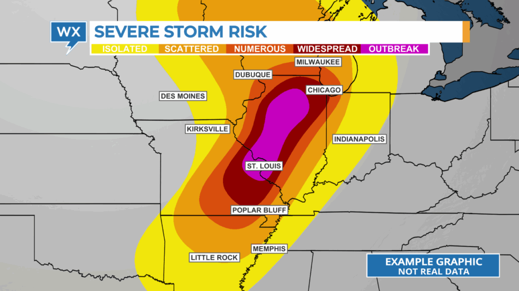
To fix the problems with the color table, broadcast meteorologists should consider a color table that uses color shading instead of the typical rainbow colors. Color shading uses just two colors, with continuous shades between those two. According to a study by Jacob Reed in 2024, this simpler color scale is more intuitive. “The perceived level of risk increases when the color scale is modified from discrete to continuous.”
REAR MORE > COLOR WEATHER RADAR FOR THE COLOR-BLIND VIEWER
By removing the color green from the scale and using continuous shades between yellow and red, the increasing risk levels are easily recognized. It’s also apparent that the color magenta represents the highest risk level. These colors and others using continuous shades work for all viewers, including those who are colorblind.
Enhancing High Risk Communication
As broadcast meteorologists, we are responsible for making complex weather information clear and accessible to everyone in our audience. The research clearly demonstrates that our current approach to communicating the Convective Outlook often creates confusion rather than clarity.
We can significantly improve public understanding of severe weather risks by implementing simple changes, as shown at the top of this article. Focus on storm coverage language, incorporate numeric risk levels, and use intuitive color scales.
At the same time, the weather enterprise must prioritize consistency and accessibility in all our communication. When we present different versions of the same information across various media outlets, we risk undermining public trust and potentially compromising safety. The evidence-based solutions presented here offer a path toward clearer, more effective severe weather communication that serves all members of our viewing audience.
Tim Heller is an AMS Certified Broadcast Meteorologist, Talent Coach, and Weather Content Consultant. He helps local TV stations and broadcast meteorologists communicate more effectively and work more efficiently.