Color Weather Radar for the Color-Blind Viewer
Radar is an essential tool for broadcast meteorologists, especially when severe or disruptive weather develops. While almost everyone has access to a regional radar on their smartphone now, broadcast meteorologists can track the rain in near-real time, right down to individual neighborhood streets, if necessary.
Even with expert analysis, radar is challenging for many viewers to understand. Not because of what the data represents (although with Dual-Pol radar, that’s probably true), but because the colors used to depict the different types of data simply don’t make sense.
The Rainbow Color Table
Most local TV stations, the National Weather Service, the Weather Channel, Fox Weather, national news outlets, and almost every weather app use rainbow colors to depict rainfall intensity. While the specific colors might vary slightly between the different sources, most depict light rain in shades of green. Yellow and orange indicate moderate-to-heavy rain. Shades of red denote heavy rain.
That’s a problem for about 8% of males and .5% of women. That’s how many people are color-blind and have trouble distinguishing different colors. For some, certain shades of red and green look very similar. For these folks, heavy rain can look like light rain, the exact opposite of what the colors are meant to represent.
The problem is worse with velocity data, which traditionally uses only shades of red and green to indicate the movement of raindrops away and toward the radar.
Color-blind people who participated in a small study conducted by HellerWeather agree: radar maps are confusing.
Living with a Color Vision Deficiency
The term “color blind” is incorrect. According to the National Eye Institute, the inability to see any color at all is very uncommon. But almost 10% of the population has a color vision deficiency (CVD). If the photoreceptors in the retina of the eye are insensitive to either red, green, or blue light, the brain cannot distinguish certain shades of these colors. Red and green cause the most problems. Although some people have trouble distinguishing certain shades of yellow and blue.
READ MORE: DATA VISUALIZATION AND THE (OVERUSED) RAINBOW COLOR TABLE
There is no cure for CVD, but most people adjust and don’t have problems with everyday activities. For example, they learn that the red light is always at the top or left side of a traffic signal, and the green light is always on the bottom or right side.
It’s one thing to know the difference between three standard colors on a common traffic signal and another thing altogether when trying to decipher a radar map showing a mish-mash of 256 colors rapidly animating across a detailed, topographic map.
Results of the HellerWeather Study
To see if I could find a better radar color table, I enlisted the help of some Facebook followers. Several people who have some degree of color vision deficiency examined maps using different radar colors created using the Max software developed by The Weather Company.
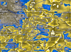
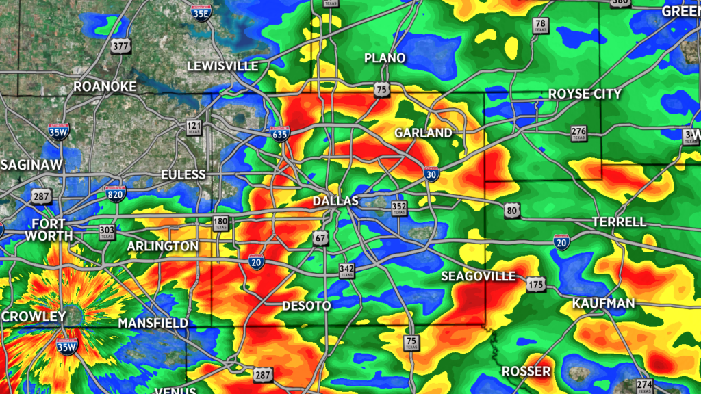
The first set of maps used a version of the typical rainbow color table. A legend or color key was purposefully left off the map to see if the individuals could independently pick out the severe weather. Without prompting, participants remarked that they needed the legend to understand the different shades. One participant said they could only identify three different colors in the map below. Another said, “There are a lot of different shades, and it is hard to tell which of the shades mean that weather is more severe.”
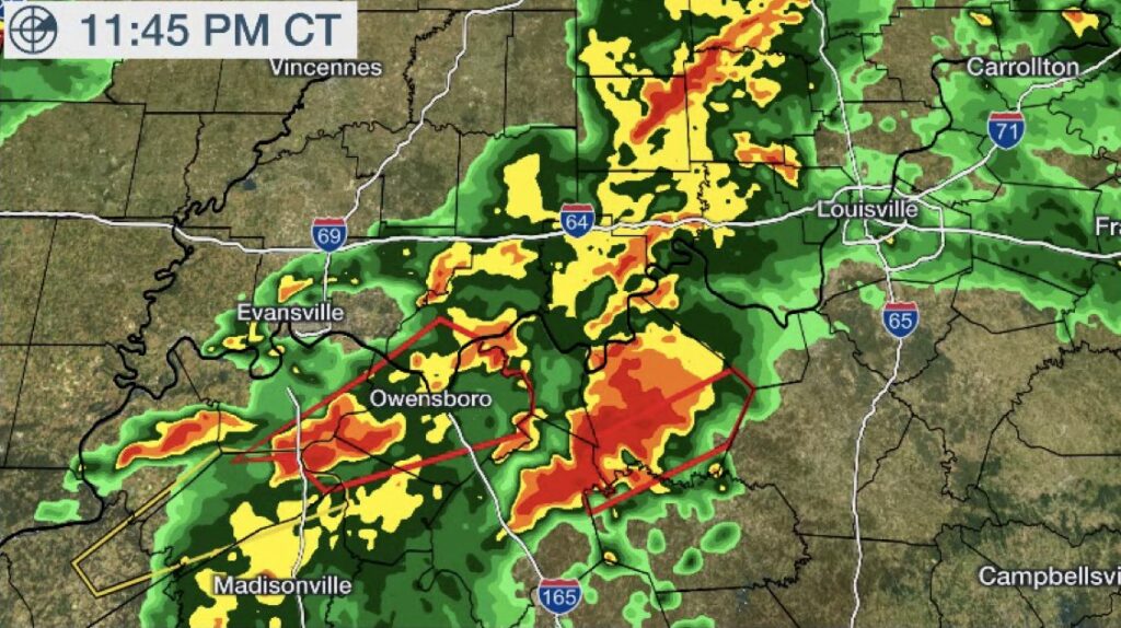
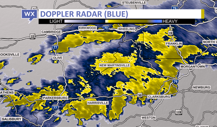
The group was then shown four different radar maps and asked to pick the one that was the easiest to understand. Two of the maps used shades of green to depict light rainfall, and two used shades of blue. The data was also overlaid on two different maps, one with detailed topography and another with a plain, grey background.
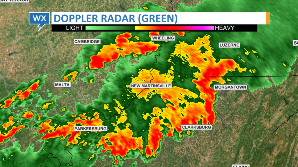
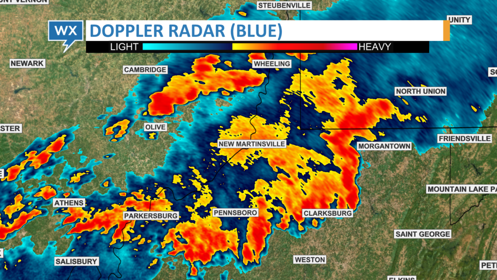
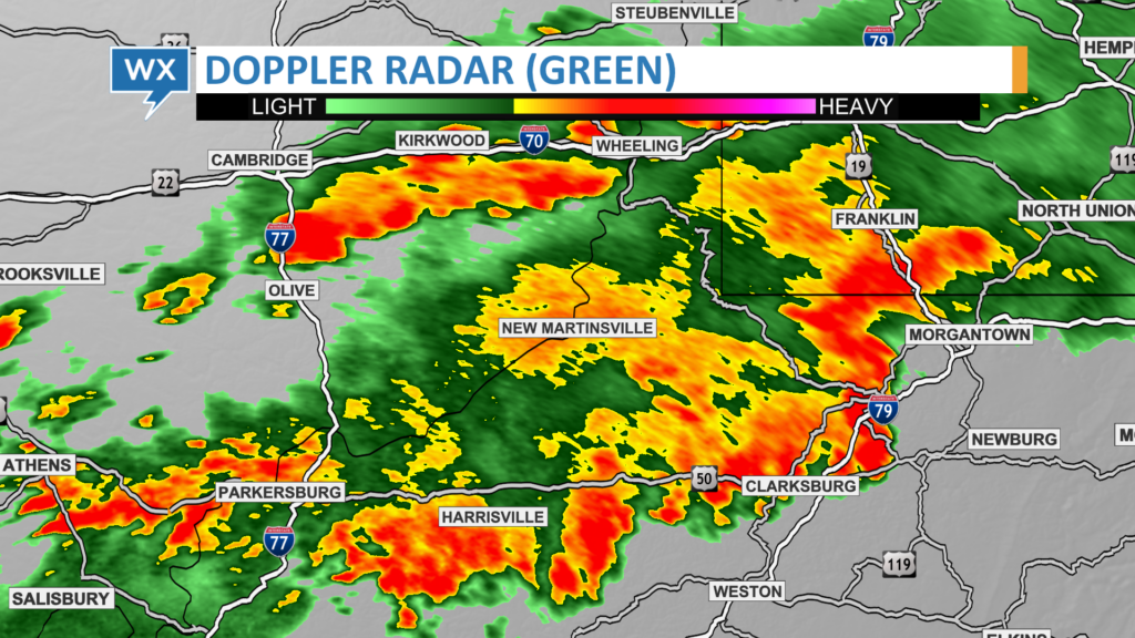
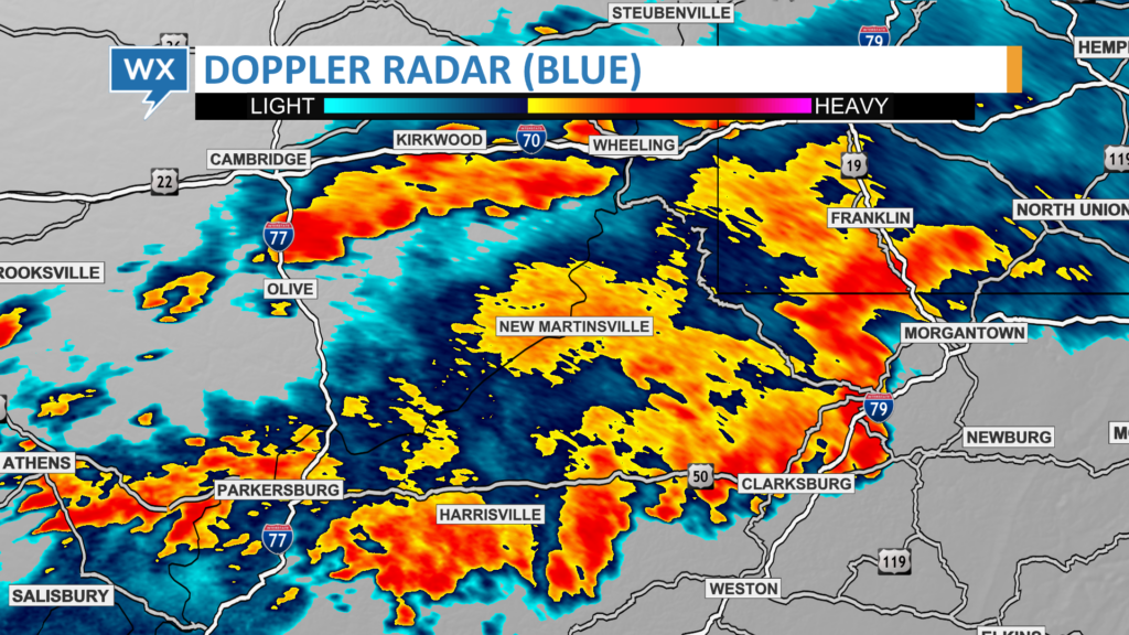
As expected, participants in the HellerWeather study had the most difficulty understanding green radar data, especially overlaid on a green topographic map. Most favored the Doppler Radar (Blue) data over the plain grey map. Participants remarked that it was easy to identify rainfall intensity on this map.
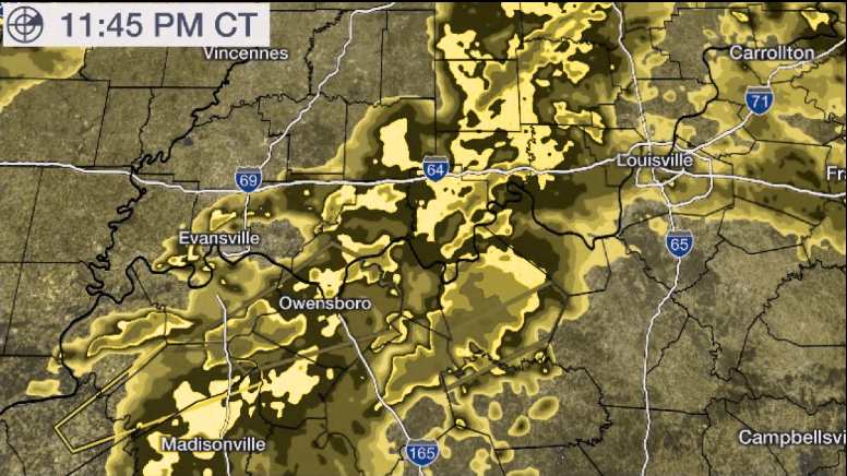
Coblis, an online color-blindness simulator, recreates what the Doppler Radar (Blue) image looks like to those who have a color-vision deficiency. Light rain is easily distinguishable, while moderate and heavy rain are noticeably different colors. Even without consulting the legend, it is immediately clear where the strongest storms are located on this radar map.
Searching for a better rainbow
The problem with the rainbow color table extends beyond radar data. As I previously wrote, broadcast meteorologists use rainbow colors to depict many different types of weather data. The order of the colors is not intuitive, the colors are applied inconsistently, and a legend is almost always required so viewers can decipher what each color represents.
There have been a few attempts to create a better rainbow color table Dr. Cameron Homeyer, a meteorology professor at the University of Oklahoma, evened out the luminance or brightness of each color, so it was easier to distinguish between light, moderate, and heavy rain.
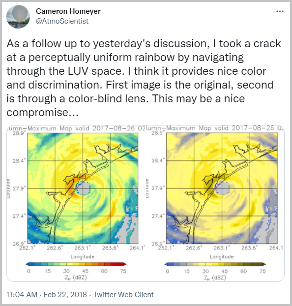
“Having a color palette that is CVD-friendly is an important goal,” he told me. “I’ll be honest in saying that this is difficult to accomplish…but it is a must if you want to have graphics equally interpretable by all.” Homeyer only uses CVD-friendly colors in his social media posts and published research.
Some in the scientific community suggest we get rid of the rainbow altogether. Several years ago, Poynter published an article urging journalists to stop using rainbow colors for data visualization. There’s even a #endrainbow hashtag urging people who create data visualizations to find alternative colors. Despite the sporadic campaigns to move away from the rainbow colors, they continue to be used extensively.
Acknowledging the problem
The National Weather Service is aware that rainbow radar data is an issue for people who are colorblind.
Bill Read, the former Director of the National Hurricane Center and Meteorologist-in-Charge at the Houston-Galveston National Weather Service office, told me weather service meteorologists can change the colors of the radar display. But that’s only for internal users.
“When the NEXRAD system was developed in the 1980s, developers were cognizant of the red-green color-blind issue. There was a user-selectable setting to change the color tables for both reflectivity and velocity to a scheme more compatible for color-blind forecasters. As I recall, the red-green tones were changed to purple-yellow tones.”
For members of the public who use the government’s online radar, however, the National Weather Service recommends using computer software to transform the graphics into discriminable colors.
Solutions to end the confusion
The weather community could develop a standard radar color table accessible to everyone. There’s no good reason anybody should be confused by the colors used on the radar. Not when there are better alternatives.
Until then, there’s an easy fix for broadcast meteorologists who use the Max graphics system from The Weather Company. Many of the new color tables available with the Max v8.4 software upgrade are CVD-safe, including several updated radar color tables. Some of the older radar color tables also work, specifically Blue Smooth, Blue HD, and Snow White Rain Blue.
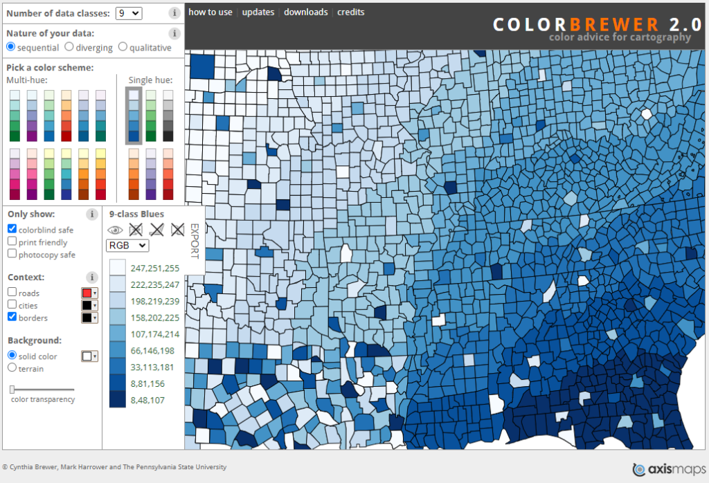
Custom CVD-friendly color tables can be created for other types of data using the online ColorBrewer tool. Several different color tables are presented along with specific red-green-blue (RGB) values for each data class.
There is no better tool to show the development of severe weather than radar. With a glance, most meteorologists and members of the public can quickly identify severe weather and take appropriate action. But precious time is wasted if some individuals, precisely 8.5% of all individuals, don’t understand a simple radar map or, worse, mistake a severe thunderstorm for light rain.
Tim Heller is an AMS Certified Broadcast Meteorologist, Talent Coach, and Weather Content Consultant. He helps local TV stations and broadcast meteorologists communicate more effectively and work more efficiently.