Data Visualization and the (overused) Rainbow Color Table
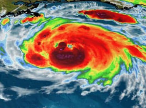
While watching the Hurricane Ida coverage, it became clear that we have a data visualization problem. Before, during, and after landfall, I saw many weather maps on-air and online using the same basic colors to display completely different types of data. They all started to look the same after the third, fifth, or tenth rainbow-colored weather map. On some maps, it was impossible to tell if the colors represented current radar, forecast rainfall, wind speeds, or something else entirely!
Meteorologists seem to love the colors of the rainbow: red, orange, yellow, green, blue, indigo, and violet. There’s the obvious connection to weather, and they look pretty when combined on the same map.
But…
When all data uses the same general colors, all data looks the same. The colors are usually applied inconsistently between different graphics, the order of the colors is not intuitive, and a legend is almost always required so viewers can decipher what each color represents.
Additionally, about 8% of the population has a color vision deficiency, more commonly referred to as color blindness. For these people, the colors red and green cause the most problems. Light rain displayed in green looks similar to heavy rain shown in red.
READ MORE: COLOR WEATHER RADAR FOR THE COLOR-BLIND VIEWER
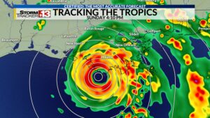 Almost every TV station uses the same reverse rainbow color table (green-yellow-orange-red) for radar data, with a few adding the color blue to show very light rain. The same colors are often used, along with others, to enhance satellite data, display observed and forecast rainfall accumulation, wind speeds, wind gusts, power outages, offshore wave heights, storm surge height, as well as wind probabilities, watches, and warnings.
It’s not just tropical weather. The same rainbow colors are also used extensively during severe weather to display the convective outlook, the risk of high winds, tornadoes, and hail, as well as the excessive rainfall forecasts, low-level winds, upper-level winds, atmospheric moisture, instability, CAPE, helicity, and more!
Ditch the Rainbow
There is a better way to display weather data. Instead of using different colors to represent different levels, amounts, or intensities, use shades of the same color.
Research conducted at Mississippi State University concluded that weather data displayed using “a monochromatic scale is more intuitive to understand than a rainbow scale.” Other studies show multiple colors on a weather map distracted viewers. Furthermore, using shades of one color did not require a legend, eliminating one thing on an already cluttered graphic.
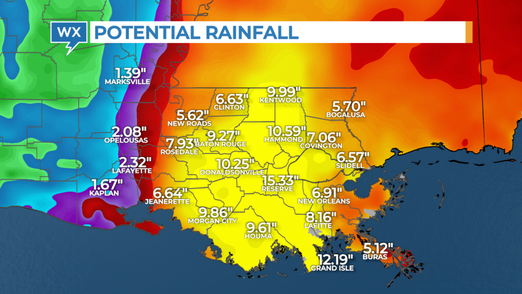
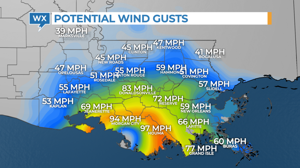
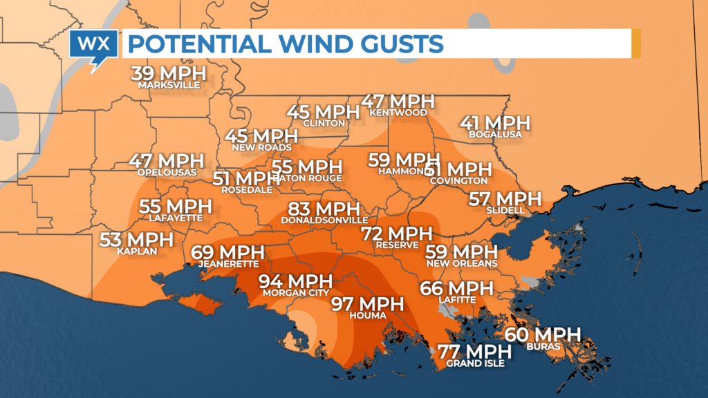
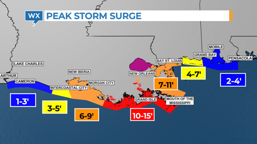
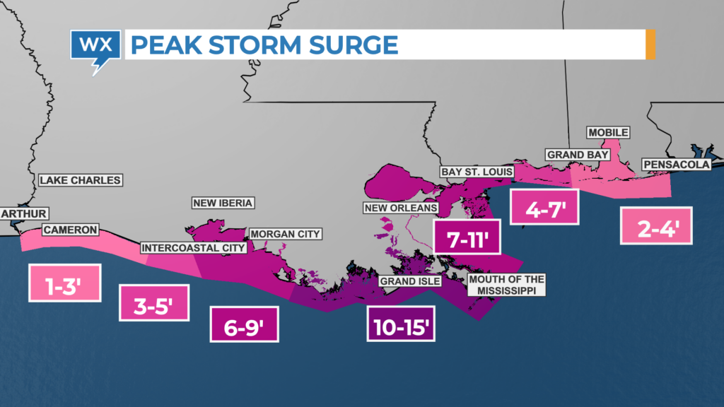
To test this theory, I created a set of graphics using data for Hurricane Ida. The first map displays data using a standard rainbow color table. The second map uses color shading. Unique colors represent different types of data, not different levels of the same data.

Create your own color tables
As you can see, broadcast meteorologists can communicate more effectively by creating their own color table rather than selecting one of the default rainbow color tables available in their graphics computer.
The AMS has developed guidelines for using colors to depict weather information. Furthermore, the National Weather Service uses a specific color table to display different types of warnings. For most other data, there’s no standard color table.
Viewers have become accustomed to seeing radar in shades of the rainbow. It’s probably best not to change that color table, although switching from green to blue for light rain would benefit those who are color blind.
READ MORE: WHOLE-BRAIN WEATHER COMMUNICATION
Consider assigning a specific color to each type of weather data across all your graphics. Most people intuitively associate red and blue with temperatures. Green is generally associated with rain. Yellow could be used for wind speeds, orange for wind gusts, purple for storm surge and water levels, etc.
When adding contours to your weather maps, consider using shades of a single color, like those generated by the ColorBrewer. Pick colors that are accessible to all viewers, including those who are color blind. Test your graphics with a color-blind simulator to see what they look like to those who have difficulty differentiating different colors.
Finally, be consistent with the color shading. Use light colors for lower values and darker shades for higher values every time.
Science Communication, not Art Appreciation
Weather data isn’t as intuitive for the average person as it is for meteorologists. Furthermore, we look at data all day long. Viewers see each map for 10-15 seconds, sometimes less!
If we want to communicate more effectively, we have to eliminate all distractions and reduce the time it takes the viewer to decipher the data. Monochromatic maps simplify the visualization. Numbers overlaid on top of colored contours are more noticeable, and higher values immediately catch the eye. Furthermore, there’s no need to add a complicated legend.
You could argue that monochromatic maps aren’t as pretty as rainbow-colored maps. But the primary objective is to maximize understanding of the data in a limited amount of time. That’s never more important than when a major hurricane is tracking toward the coast or tornadoes are developing across the region.
Tim Heller is an AMS Certified Broadcast Meteorologist, Talent Coach, and Weather Content Consultant. He helps local TV stations and broadcast meteorologists communicate more effectively on-air, online, and on social media.