Severe Weather Storytelling Tips for Broadcast Meteorologists
When thunderstorms, tornadoes, hurricanes, or floods threaten, many people still turn to local television stations for the latest information. This presents an opportunity for broadcast meteorologists to solidify their position as trusted sources for essential weather information. Reputations are built one storm at a time. However, those reputations can be quickly ruined if broadcast meteorologists don’t provide critical information when viewers need it most.
Effective severe weather coverage requires a comprehensive plan that enables broadcast meteorologists to quickly tell engaging, informative weather stories that empower viewers to make smart decisions.
Here are four ways broadcast meteorologists can level up their severe weather storytelling.
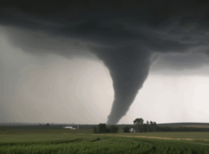
Track severe weather before it develops.
One graphic that almost every broadcast meteorologist uses to convey the possibility of severe weather is the Convective Outlook issued by the Storm Prediction Center (SPC). However, it doesn’t tell viewers much. The Outlook indicates where severe storms might develop, but it doesn’t define what type of severe weather could potentially develop or when it might develop.
SPC also produces three additional maps that separately indicate the probability of damaging winds, large hail, and tornadoes. Visually, these don’t look much different than the categorical risk map, and there’s a possibility some viewers might think a small percentage means severe weather is unlikely.
There are better options.
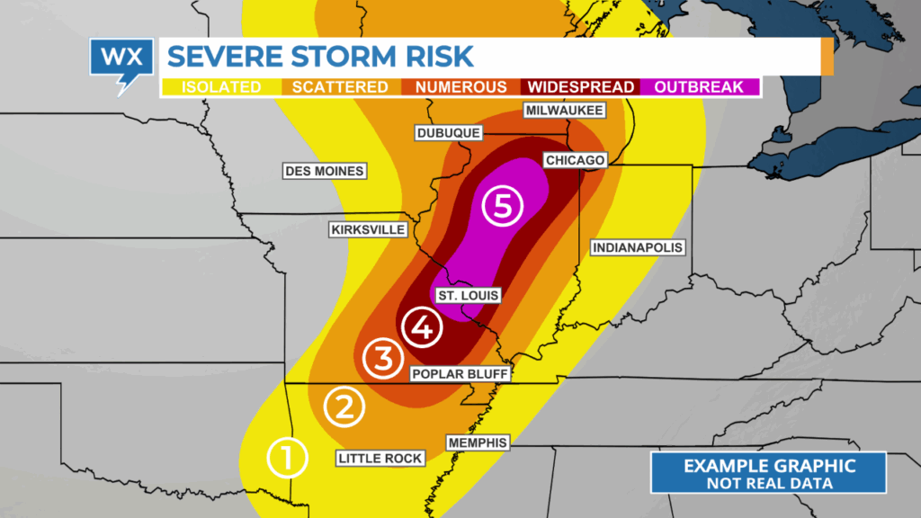
A graphic that ranks the probability of each type of severe weather would help clarify the types of severe weather that are possible and which are the greatest threats.
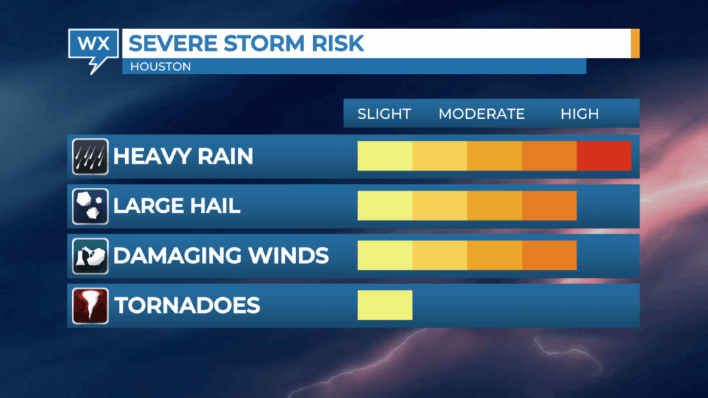
A text-based graphic that summarizes what kind of severe weather could develop, when that might happen, and the impacts of those storms can be helpful for viewers who need to read information to understand it.

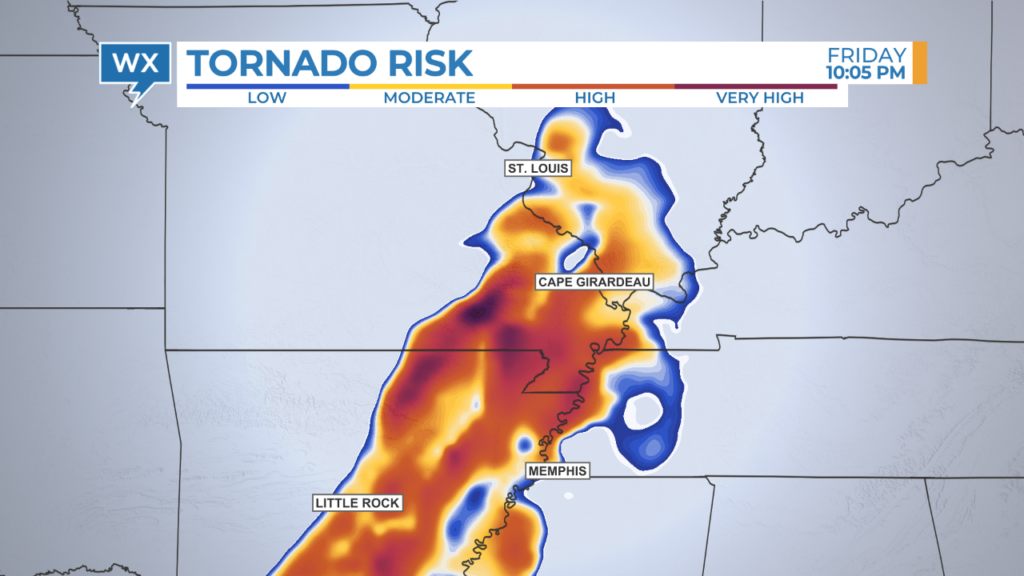
Data vendors like The Weather Company* also offer their clients data products that break down the risk for each type of severe weather element, such as the risk of large hail or tornadoes.
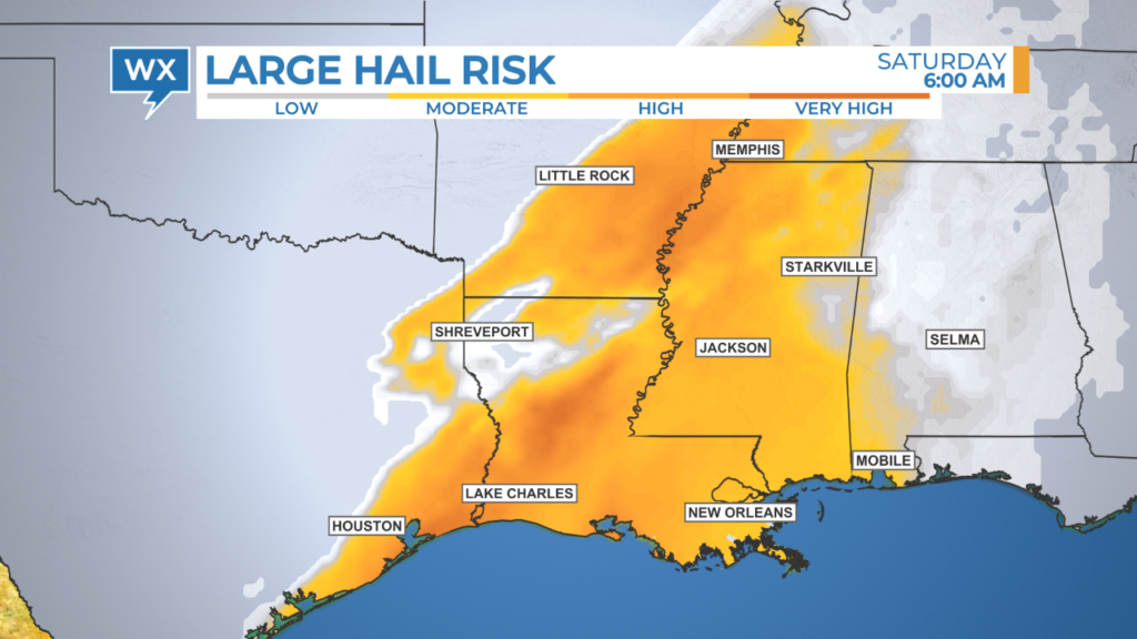
This data is usually derived from forecast models and can be animated to show how the risk of severe weather changes over time throughout the region.
These graphics can also be used to indicate when the risk of severe weather is lower and over. This type of information can be calming for viewers who have been traumatized by adverse weather conditions in the past.
Don’t tell stories about data. Use the data to tell a story.
Weather data vendors assign a default color table to most types of weather data. However, these color tables are usually designed to optimize meteorological analysis, not tell engaging weather stories. Broadcast meteorologists should look through all available options or create a custom color table for each type of data to ensure it delivers the essential message in a way that’s easy for all viewers to understand.
One color table that needs to be replaced is the default choice used by the Storm Prediction Center to depict the likelihood of severe weather in the Convective Outlook. Mixing shades of red and green in the same graphic is not ideal for viewers who have a color-vision deficiency, more commonly referred to as being colorblind.
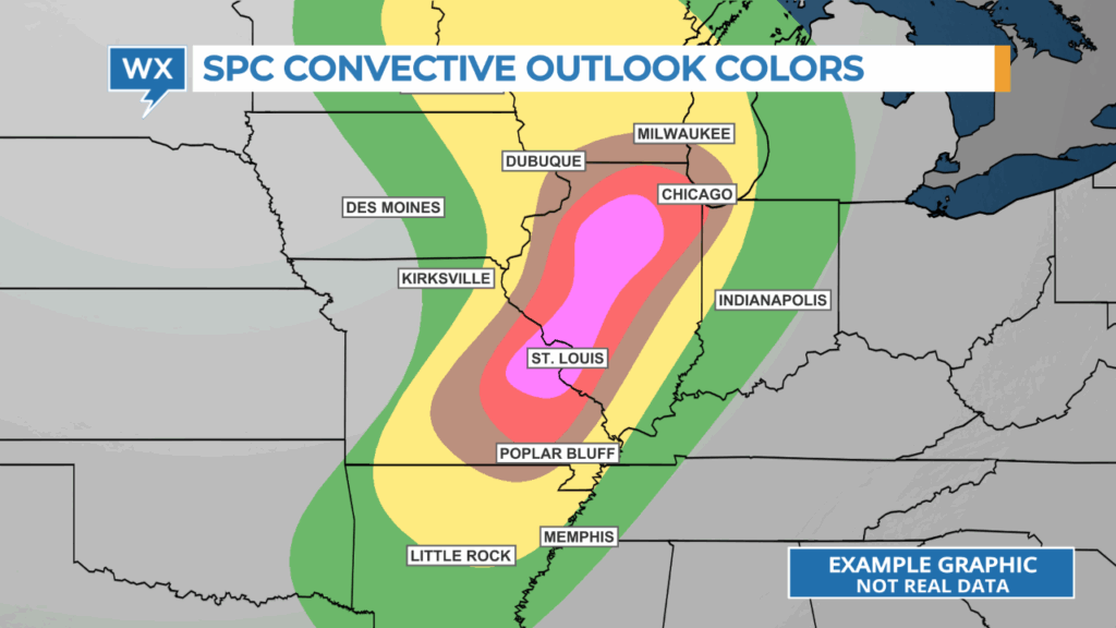

A custom color table created by HellerWeather removes the conflicting shades of red and green while communicating where there’s the greatest risk of severe storms.
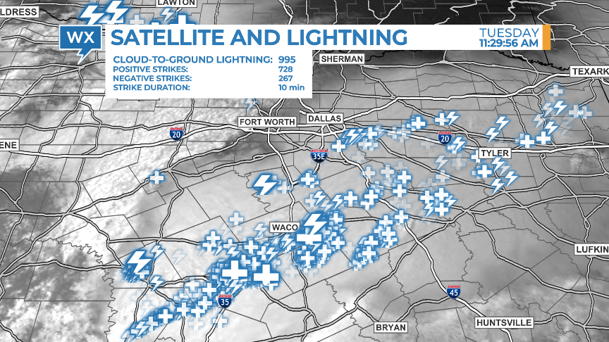
Combining different types of data can sometimes communicate the risk of severe weather more effectively than showing them separately. Overlaying lightning data on top of visible satellite data highlights the location of the most electrically active part of the thunderstorm.
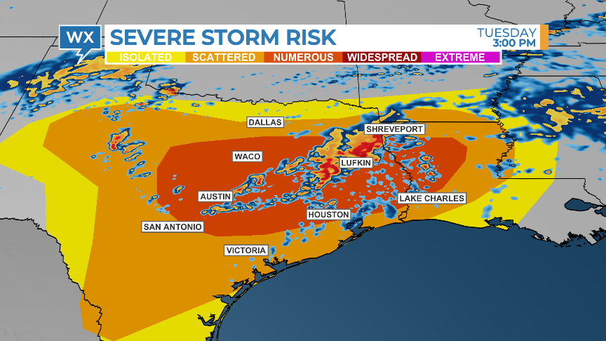
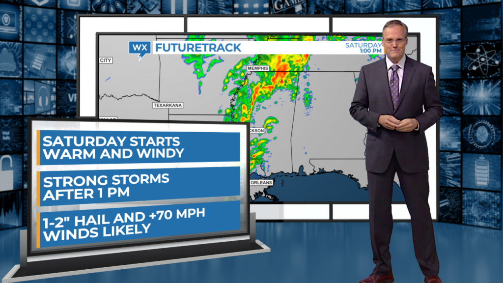
Showing future radar data over the convective outlook (with an updated color table!) can identify which storms are more likely to become severe or weaken over time.
Demonstrate your meteorological expertise.
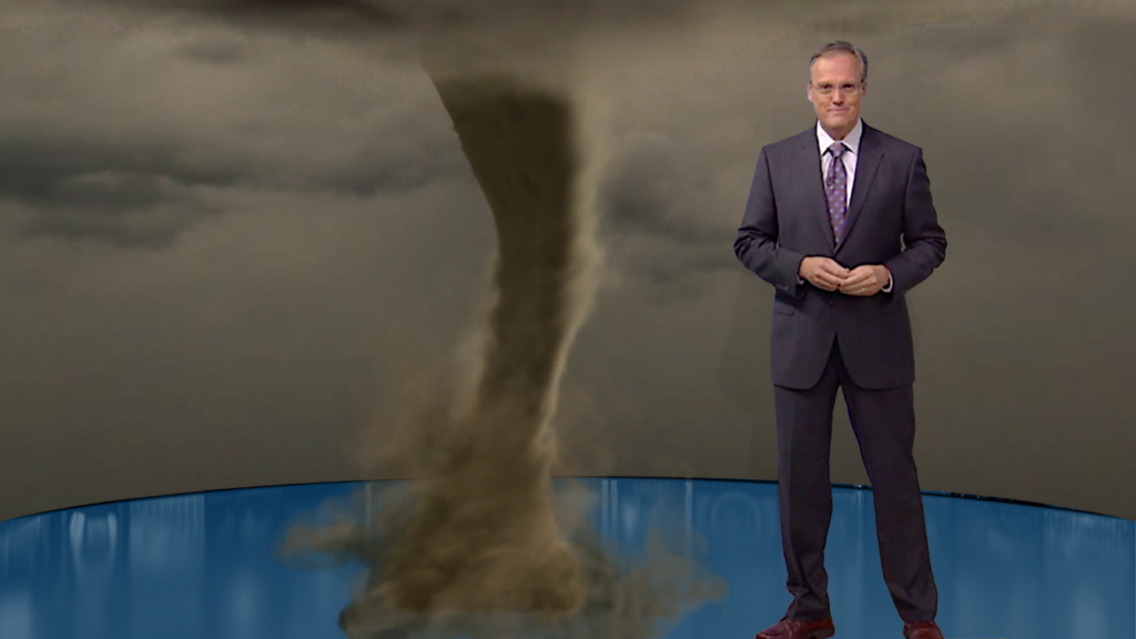
Severe weather can be complicated and confusing for viewers to understand. Max Reality software, developed by The Weather Company, enables broadcast meteorologists to differentiate their weather coverage and enhance their storytelling with dynamic, computer-generated graphics that look realistic.
A simple panel that appears to emerge from a hatch in the studio floor can add extra information to traditional weather maps, focusing viewers’ attention on the critical details they need to know.
Studio-size weather explainers can create memorable moments within a newscast and establish the broadcast meteorologist as the go-to weather expert in their community. Weather explainers are easier to understand when viewers visually see the elements coming together and changing over time.
Be an eyewitness to the weather.
Consider who on the team will chase the severe weather when it develops and how those reports will be broadcast. Software like The Weather Company’s Max Velocity allows meteorologists or reporters to stream live coverage or record quick hits for digital platforms while away from the television station.
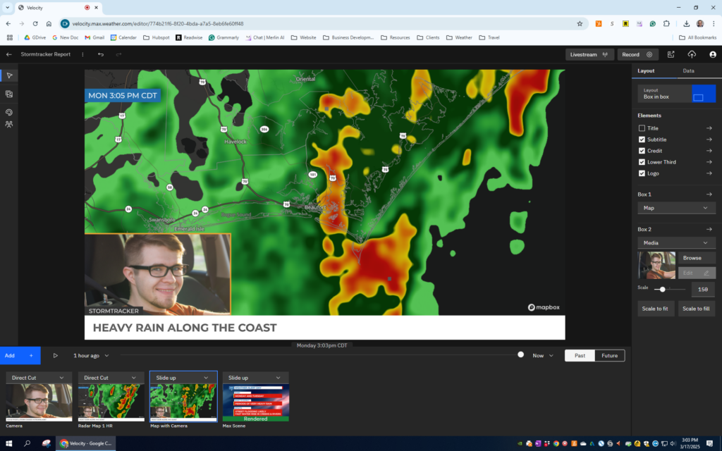
The cloud-based software can be accessed using any laptop. Radar and several other types of data can be displayed, showing past and future development. Graphics updated by the team back at the studio can also be added to Max Velocity stories.
Prepare and practice.
After writing up a severe weather coverage plan and configuring the graphics workspace to enable quick storytelling, it’s important to practice covering severe weather.
When the weather is quiet, track storms off-air that are developing outside of the local television market. Don’t just go through the motions. Turn on the studio lights and have production record the rehearsal. Track the storms at the severe weather desk or in front of the chromkey as if you were doing it live. If the plan includes team coverage, practice that too. Then review the coverage afterward.
I learned three things about covering severe weather while working on-air for 35 years: the best time to prepare to tell informative, engaging weather stories is before the storms develop, you’re never as prepared as you think, and nothing will make you better at tracking storms than doing it over and over and over.
*HellerWeather has a marketing and training partnership with The Weather Company. If your weather team needs assistance developing a severe weather coverage plan and setting up the graphics workspace for success, Talk to Tim.
Tim Heller is an AMS Certified Broadcast Meteorologist and Weather Communications Coach. He helps local TV stations and broadcast meteorologists communicate more effectively and work more efficiently.