10 Things More Interesting Than a SatRad Loop

The satellite/radar loop is a regular part of most local television weathercasts. But it shouldn’t be the only tool broadcast meteorologists use to track developing weather.
Watch any local television newscast, and you’ll likely see a satellite/radar loop. Probably more than one. This versatile scene is more commonly called “SatRad” by broadcast meteorologists. It shows what happened earlier, what’s happening now, whether storms are strengthening or weakening, and the direction the weather is moving. The SatRad is also visually interesting. The rainbow-colored radar data stands out over the bright white clouds below.
There are good reasons to use a SatRad loop. However, there are over 70 different types of data in the Max weather graphics system, developed by The Weather Company and used at hundreds of local television stations across the country. Much of that data is more meteorologically interesting and visually engaging than the standard SatRad loop.
Here are ten scenes created using software and data from The Weather Company* that broadcast meteorologists should consider incorporating into their daily weather coverage:
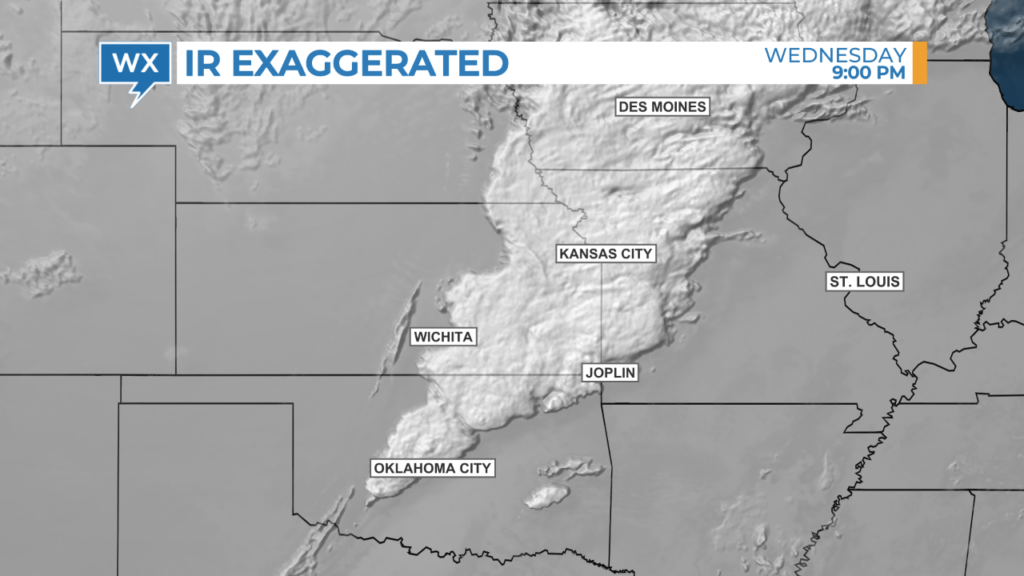
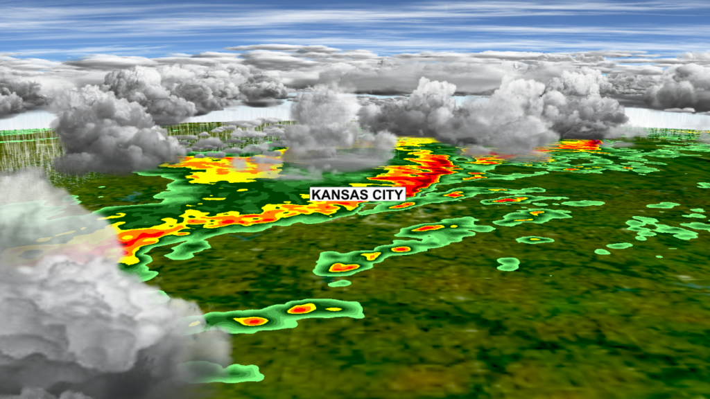
In the standard SatRad image, radar data is usually layered over the infrared (IR) satellite image. This covers some of the more interesting details in the cloud data. Showing the satellite without the radar and exaggerating the vertical structure of the clouds highlights the stronger storms.
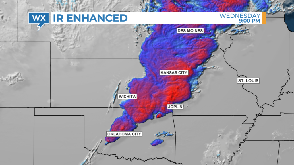
Applying a custom color table makes it even easier to see the location of potentially disruptive weather. Color-enhanced satellite data is often used to track tropical cyclones, but it can also be used with convective thunderstorms.
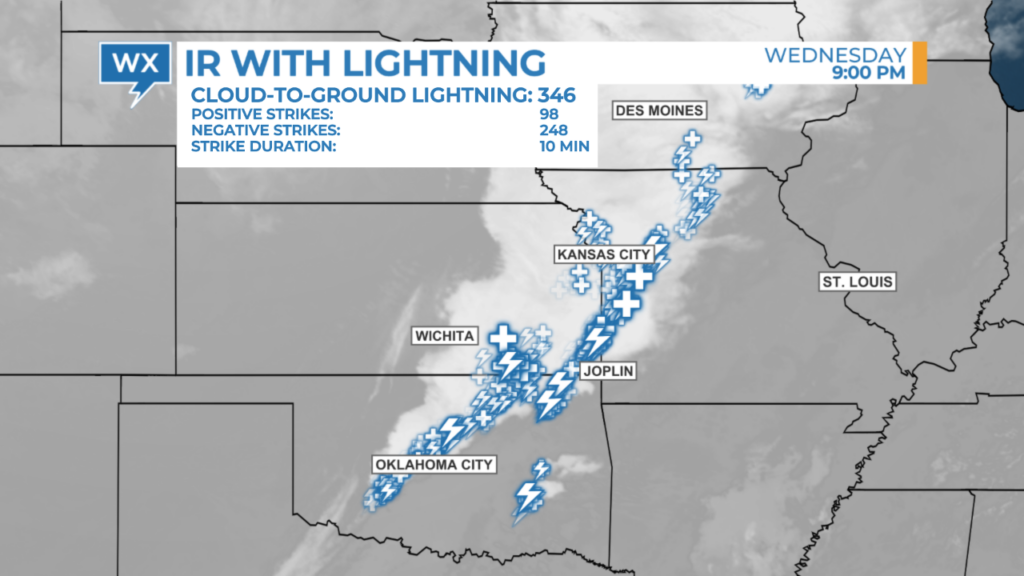
Lightning data is often displayed over radar data. Similar to the data stacking problem in a SatRad image, the lightning data covers the radar data, which shows the location of the stronger thunderstorms that produce the lightning. A better option is to use lightning data with satellite imagery.
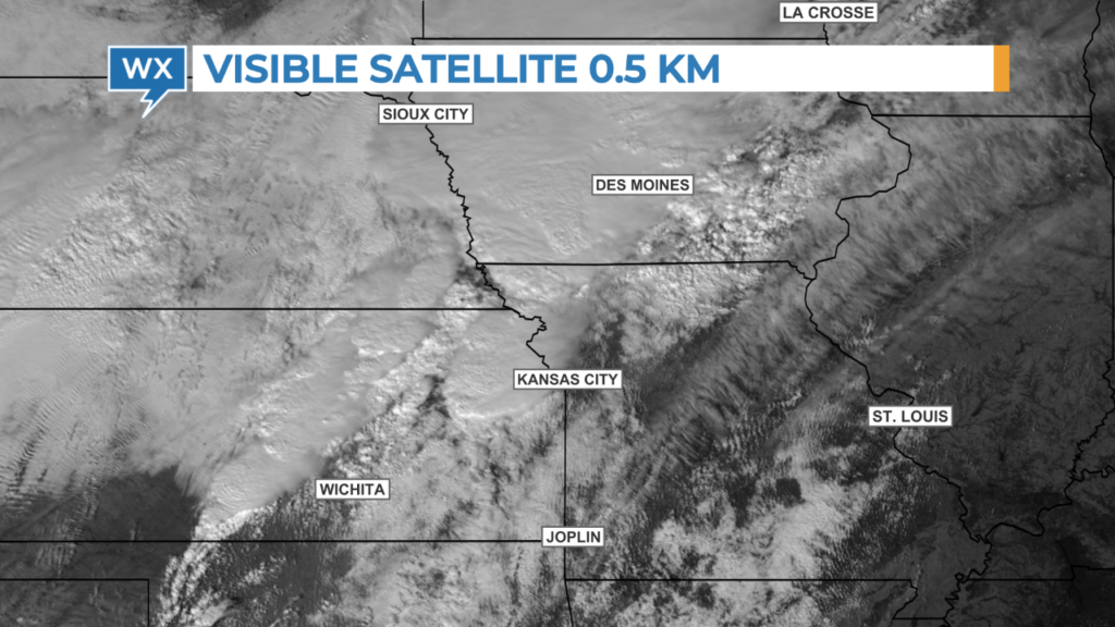
Broadcast meteorologists can deliver an entire meteorology lesson using visible satellite imagery. Feathery, thin cirrus clouds, along with smaller, puffy cumulus clouds and building cumulonimbus clouds, are easily identified in the high-resolution 0.5 km data. Mesoscale satellite sectors are updated every minute to create an ultra-smooth timelapse of developing weather.
MORE IDEAS > DIFFERENTIATE YOUR WEATHER COVERAGE WITH UNIQUE VISUALIZATIONS
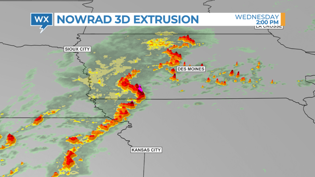
In addition to satellite data, the extrusion tool can be applied to radar data to highlight stronger thunderstorms within a convective complex. This tool also allows broadcast meteorologists to adjust the transparency of the data that is not extruded, which helps illuminate smaller thunderstorms.
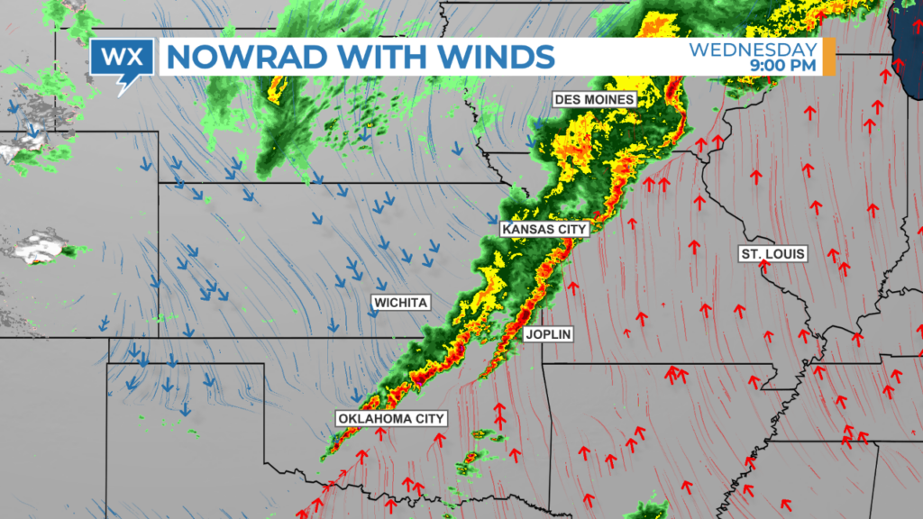
Rather than drawing a cold front on the weather map, broadcast meteorologists can use color-coded wind streamlines to explain what’s causing a line of thunderstorms to develop. The image below shows the typical severe weather setup: warm air blowing in from the south, colliding with cool air from the northwest.
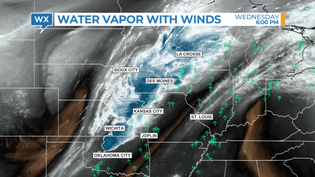
Wind arrows and streamlines at different altitudes can be combined with water vapor satellite data to highlight where significant turning of the winds could initiate storm rotation in developing thunderstorms.
Broadcast meteorologists can take viewers on a flight through the clouds and between raindrops using Max Sky. Both current radar and future radar can be used with this realistic, animating weather data.
Enhanced satellite data can also be used with Max Reality software developed by The Weather Company. Broadcast meteorologists can show an overview of the storm system or zoom in and track individual storms on the radar. Augmented reality scenes focus viewers’ attention and work great as a tease element.

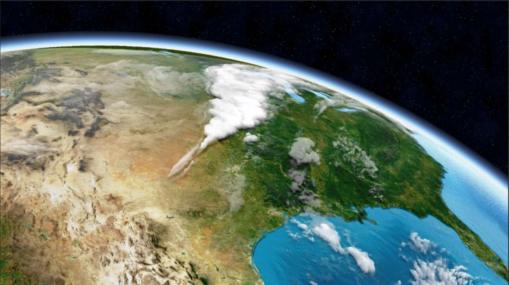
Finally, broadcast meteorologists can simulate the view of the weather from space with exaggerated IR satellite imagery and the high-resolution Maximum Earth, available from The Weather Company. Tilt the map at an extreme angle and use a slow camera move to create a realistic visual.
Showing the same data day after day is repetitive. That’s one of the things viewers don’t like about the weather coverage they see on TV. In research conducted for The Weather Company, viewers also told us they want weather teams to explain what’s causing the changes in the weather. By combining different types of data, broadcast meteorologists can do both: reduce the amount of repetition and tell more interesting weather stories.
*HellerWeather has a marketing and training partnership with The Weather Company. If your weather team needs creative guidance on producing weather content that is anything but boring, Talk to Tim.
Tim Heller is an AMS Certified Broadcast Meteorologist and Weather Communications Coach. He helps local TV stations and broadcast meteorologists communicate more effectively and work more efficiently.