The Best Weather Stories Are Not Complicated

Early in my career, I was the chief meteorologist at KGAN in Cedar Rapids, Iowa. The station was Channel 2, and management thought it would be on-brand to produce a weather tease in the first news block called “Weather in 2 Words.”
How do you explain that a winter storm could produce 6-8″ of blowing and drifting snow? Snow Day!
What do you say when it’s supposed to rain the week of Christmas? More Reindeer.
Sounds easy until you realize you need to do that for every newscast, and the two words must be different every time. Sunny, Warm only works once.
This exercise in selective word use taught me a valuable lesson. Once you figure out how to reduce the forecast to two words, you can do it in ten or twenty. The key is to edit the message down to the bits of information viewers want and need to know about the weather right now. In my coaching with broadcast meteorologists today, I call this The Essential Message.
Eliminate the Unessential
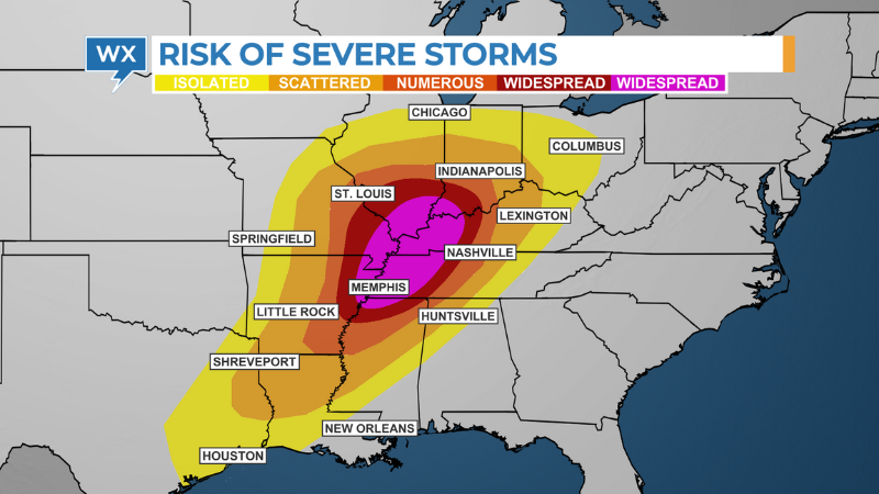
Weather visualizations are a vital part of the message. The graphics we produce, publish, and post should consistently deliver the message and not detract from it. Everything, from the title banner to the background to the data we display on top, should help tell the weather story of the moment. And if it doesn’t, delete it.
In her book, Storytelling with Data, Cole Nussbaumer Knaflic reminds us that we only have a few seconds to communicate our message. “Every single element you add to that page or screen takes up cognitive load on the part of your audience,” Knaflic writes. “Identify anything that isn’t adding informative value and remove those things.”

At the AMS Conference on Broadcast Meteorology in 2015, graphic designer Kent Kerr delivered a presentation on “The Power of Human Communication.” Kerr suggested that when we create weather graphics, the question we need to ask is not, “What else does this graphic need.” Rather we should be asking, “What else doesn’t this graphic need?” What can you eliminate and still deliver the essential message?
READ MORE: WHAT METEOROLOGISTS NEED TO KNOW ABOUT DATA VISUALIZATION
Weather vendors make it very easy for broadcast meteorologists to add multiple types of data in one scene. As a result, we sometimes end up creating what I call, “rainbow-colored data vomit.” We can better serve our viewers if we are selective about the data we use in our weather visualizations.
This means you might have several different types of Futuretrack animations in your library. One version might show future rainfall and cloud cover when there’s an increasing chance of rain. Another version might include animated streamlines for days when winds are expected to be strong. When there’s a significant temperature change, you might only show future temperatures over colored isotherms.
Tell one good story
According to research from Magid, 81% of local news viewers say, “Most of what I see in a weathercast I already know.” Of course, they do. Weather apps offer up the forecast anytime, anywhere. And these apps are getting smarter and more useful.
Since most viewers already know at least part of the forecast, this frees broadcast meteorologists to focus on the everyday weather events viewers care about. Rather than trying to explain everything happening in the weather, focus on the essential information in your weather story and the visualizations that explain that story.
The old saying is true in this case; less really is more.
Tim Heller is an AMS Certified Broadcast Meteorologist, Talent Coach, and Weather Content Consultant. He helps local TV stations and broadcast meteorologists communicate more effectively on-air, online, and on social media.
