Creative Use of Complex Meteorological Data

Broadcast meteorologists have access to more data in the computer graphics system than they could ever use. The data is suitable for forecasting, but most of it is beyond the comprehension of the average viewer. Used creatively, however, broadcast meteorologists can turn complicated weather data into compelling weather stories.
READ MORE: DON’T TELL VIEWERS A WEATHER STORY. DO THIS INSTEAD
Most people probably don’t understand the significance of precipitable water levels climbing above two inches. But they might be interested to know that atmospheric moisture is increasing and therefore so is the chance for heavy downpours.
Forecast models sometimes indicate potential tropical cyclone development in the 850mb vorticity field. Referring to the data as “Low-Level Spin” makes more sense for the person watching at home.
COMBINING DIFFERENT DATA
Using two or more different types of data and a custom color table can help explain the meteorology. Surface temperatures that only show the freeze line layered on top of the radar can illustrate where freezing rain is falling. Shading temperatures 10°C and above in the 700mb layer and placing it on top of radar data can demonstrate where the mid-level cap is limiting thunderstorm development.
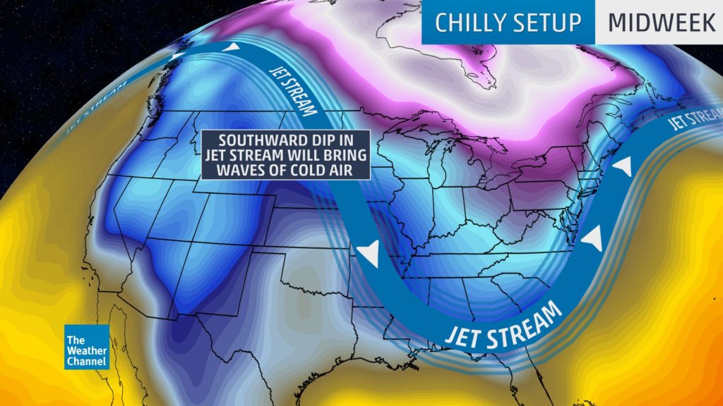
The Weather Channel commonly uses surface isotherms along with jet stream winds to represent the movement of cooler and warmer air. The word “temperature” isn’t used on the map below, although that’s the data used to tell the story.
LET THE DATA DO THE WORK
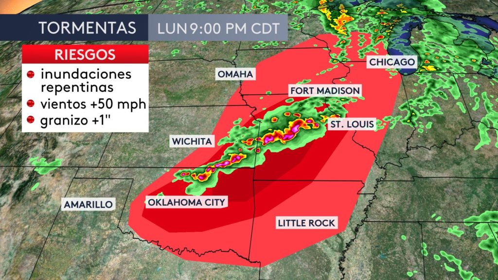
Instead of drawing a polygon on the map, AccuWeather used the Storm Prediction Center’s convective outlook under radar data to highlight where storms are more likely to become severe. Also, notice they used different shades of red instead of the usual color scale to simplify the message.
SMARTER SCIENCE
This isn’t “dumbing down” the science of meteorology. This is making the information accessible to the general public. The data is there for viewers with advanced meteorological knowledge. Furthermore, some viewers might appreciate the way you creatively conceptualized the information.
Here are some common data types and phrases that can be used to humanize the information:
| DATA PARAMETER | OPTIONAL MAP TITLE |
| PRECIPITABLE WATER | ATMOSPHERIC MOISTURE |
| RELATIVE VORTICITY | LOW-LEVEL SPIN |
| CAPE | UPDRAFT STRENGTH |
| HELICITY | ROTATION STRENGTH |
| SUPERCELL COMPOSITE PARAMETER | SEVERE STORM POTENTIAL |
| 500MB HEIGHTS / STREAMLINES | STEERING CURRENTS |
| 250MB HEIGHTS / STREAMLINES | UPPER-AIR WIND FLOW |
TOO MUCH OF A GOOD THING
With the ability to add multiple layers to a scene, it’s easy to go too far with this idea. Ideally, there should only be one message per map. You might use two or three different types of data, but altogether they should tell one part of the weather story.
Tim Heller is an AMS Certified Broadcast Meteorologist, Talent Coach, and Weather Content Consultant. He helps local TV stations and broadcast meteorologists communicate more effectively on-air, online, and on social media.
Read more News & Insights from HellerWeather