10 Best Practices to Improve Radar Coverage
Severe weather season is right around the corner. Now is a good time for weather teams to review or establish best practices for tracking storms on radar. Consistent, comprehensive weather coverage creates trust and helps build a loyal following on-air and online.
Viewers don’t have time to decipher complicated maps during severe weather. They should be able to immediately understand what’s happening, where it’s happening, and whether or not they should take protective action. The ten best practices listed below will simplify the radar display for the viewer.
1. Stop the timelapse
The timelapse function shows viewers the direction storms are moving and whether they are strengthening or weakening. However, if the data is always moving, it isn’t very easy to see where thunderstorms are currently located. Stop the timelapse and shows viewers what’s happening right now.
2. Get local
Develop a habit of starting with a wide view on the radar map and then zooming into individual storms. And then get closer. Viewers use street-level maps on their smartphones every day. They expect the same from you. People naturally want to know what’s going on in their neighborhood. Show them. You can’t do this too much.
READ MORE: 10 MORE BEST PRACTICES TO IMPROVE RADAR COVERAGE
3. Add landmarks
It’s been said that many people can’t find themselves on a map. But they might know where they live in relation to local landmarks. Add places like parks, monuments, shopping centers, and churches to your radar base map. Similarly, label major highways using common names like “West Loop” or “East Turnpike.”
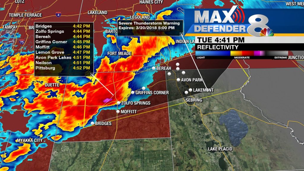
4. Track the Storms
Showing when thunderstorms are estimated to affect local communities is one of the most impactful things a broadcast meteorologist can do during severe weather coverage. Don’t just list the cities. Announce a few of the bigger communities for those who are only half-listening to the TV. And make sure those local landmarks appear in the ETA list.
5. Check the wind
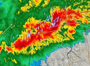
Most television stations use the word Doppler in their radar brand name. However, many seldom show the Doppler winds on-air. This data shows rotating winds within tiny couplets, as well as wind speeds along a gust front. Show the Doppler winds and use the pixel query to explain to viewers how fast winds are blowing in the storms.
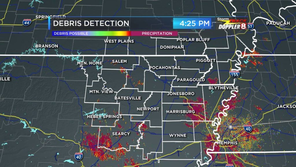
6. Correlate the Coefficient
Dual-pol radar data is a great analysis tool for meteorologists. However, it can be confusing for viewers. Broadcast meteorologists should only consider showing this data on-air if they have the time and ability to fully explain it in the simplest terms.
7. Light up the Lightning
While viewers might not understand the implications of Specific Differential Phase data, they do understand lightning. The strike counter is also an excellent tool to check whether a storm is strengthening or weakening. Make sure the lightning strike icon isn’t so big that it covers the radar data below.
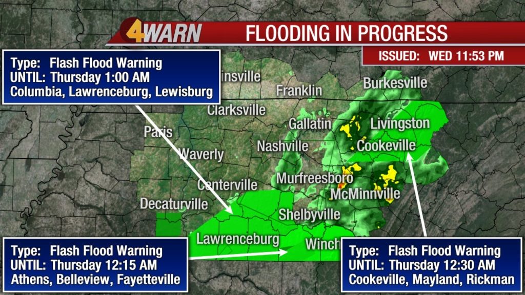
8. One Message per Map
Frequently during an active severe weather event, several watches and warnings will be in effect simultaneously. Whenever possible, simplify the radar display and show one warning at a time. Or, at the very least, show all the same types of alerts one at a time.
9. Avoid arrows
There’s no right or wrong way to use arrows, which means there’s no consistent way to use them. Some broadcast meteorologists use pointers to identify particular features on the weather map. Others use them to show which direction storms are moving. On many graphics computers, arrows connect the warning text with the warning box. To avoid confusion, avoid using arrows altogether.
10. Use the sweep line, sometimes
The radar sweep line reminds the viewer that the data they see is updating in real-time. On some weather graphics systems, like Tru Vu Max, the sweep line can be set to highlight intense storms. It’s good practice to start on a broad view on the radar map with the sweep line rotating across the area. However, the sweep line can produce unnecessary clutter when posting images to social media. Create a version of the radar scene without the sweep line for social media posts.
Radar is a powerful storytelling tool. Although most people have access to some sort of radar data on their computers and/or smartphones, the average person can’t track storms as well as broadcast meteorologists. We know what the radar data means. We can interpret threats and impacts. And we can cover the storms neighborhood by neighborhood. Use your expertise and stand out from the competition.
Does your weather team have some best practices not listed above? Let me know!
Tim Heller is an AMS Certified Broadcast Meteorologist, Talent Coach, and Weather Content Consultant. He helps local TV stations and broadcast meteorologists communicate more effectively on-air, online, and on social media.
Read more News & Insights from HellerWeather